So with a long haul and frequent testing, you build a website. You did all your marketing stuff right.
After a month of hard work, you switch to Google Analytics to check the traffic.
Zero conversion!
Now, you may have got two things wrong:
- You might have funnel wrong traffic
- You might have missed the value of CTA.
CTA is what we are going to focus on today.
What are CTAs?
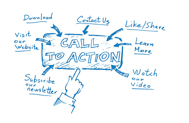
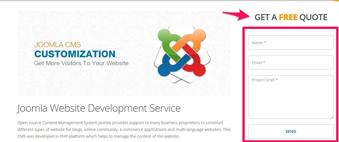
A website marketing strategy does not work, no matter how much effort and time you give to execute that strategy or plan into action if you forget to include Call-To-Actions in it. If you own a website and want to track or determine the success or failure of your online presence, you need to include an important factor: CTAs which stands for Call to Actions.
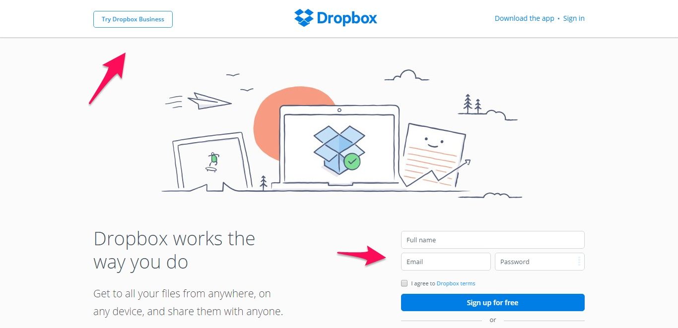
In the above image, check how Dropbox has effectively used the call to actions to grab user attention. From a simple easy to use the form to a button with text that demands action, Dropbox has done their homework.
CTAs have become an important element in the inbound marketing of any website today. Though, in past, it was more used in eCommerce sites, but, things have changed a lot now. We encounter lots of CTAs in almost all sites on the web today. No doubt, it has become an essential part of any website. It can come in different forms, be it filling a contact form, or signing up a newsletter, and so on. It has proven very effective to measure the success of any site and compel users to take proper action that you want them to take.
CTAs are very close to inbound marketers’ heart. It holds a very special place in their heart. Knowingly and unknowingly we go through lots of CTAs on each website we browse on the internet today. Without proper and functioning CTAs, your website is incomplete and will not generate leads and conversions that you want. And a website which does not convert is useless, we all know that.
Wondering how to create an effective Call-to-Actions that convert?
Here’s a list of top 10 techniques that will help you to achieve your goal. So, if you want to create a Call-To-Actions that actually converts, then consider implementing these given tips.
Set Goal
Many of the marketers mess up with their CTAs because they are confused themselves. A confused CTA can make your user confused. So, you should have a clear understanding of your goal. The main goal of any website is to drive traffic, engage customers, generate leads and increase conversion.
Marketers or business owners should carefully consider their website goals to ensure that they are putting forth the most important message of their brand or business. Before adding CTAs set a goal and try leveraging interactive features that engage your visitors and compel them to help you reach your goal. Take an example from Netflix – Their primary goal is to increase brand awareness and increase user acquisition. This is why they use influential phrasing like “cancel anytime” and “Join for the free month.”
Define its objective clearly
Once you are done with setting up your goal, you are almost half way ahead of executing your CTA strategy. While creating a CTA, it is very important that you make its objective clear. Be it filling up the contact form, or registering for an event, be it subscribing to your newsletter or be it requesting a quote, make your CTA simple and clear. So that a user can easily get what’s the actual objective of your CTAs.
Add value
One of the effective things to boost your conversion is to add value to your call to actions. Consider including an offer or a special promotion in you call to actions that your users can’t ignore. Having added such value to your call to action makes your visitors know that they are getting a special deal. Some of the examples of value-added call to actions are, “Schedule a free consultation today”, “call now to get 40% flat discount”, “call today for free quotes”, “sign up now for special offer” , “Book an appointment today to get 20% off” and so on.
Write result oriented copy
This is one of the toughest things for marketers to do. Writing a copy that attracts visitors’ attention and compelling them to take action is not an easy task. You should keep your call to action copy short and simple, yet must be powerful. You copy should focus on the tasks results; everybody cares about results not the process of the tasks. For example, if your call to action button is trying to convince people to download an ebook on latest web design trends that you need to know then, you should not just go with ”Download ebook”, consider using “Boost your business with these latest web design trends .” Doesn’t it sound more interesting and more engaging?
Use actionable verbs
Call to actions should begin with a powerful imperative verb that compels visitors to take action after reading it. So, make sure to use actionable verbs to compel your site’s visitors to complete your desired action. Basically, actionable verbs are commons words that can be performed by any person. For example, if you include “click” in your call to action, then you are telling your visitors to click certain link or button. Some of the other actionable verbs include: call, buy, order, get, download, sign up, register, join, try, request a quote, and place your order, and so on.
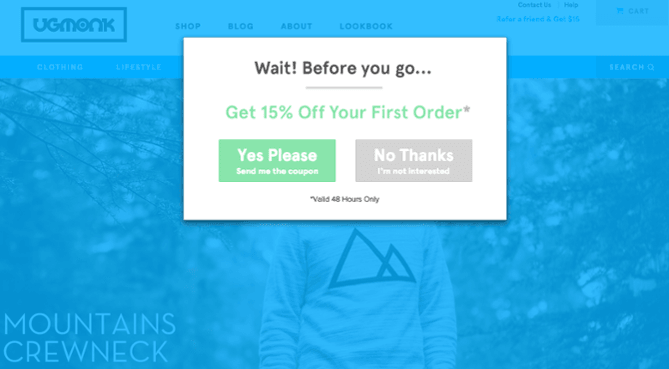
I’m really into what Ugmonk does with their exit pop-ups. They try to play with human’s psychology. Using terms like 15% off and using wording like “Yes Please” helps to interact like a human.
Create Urgency
One of the common things most of the visitors do is, they go through the sites and encounters biggest deals and offers, but they keep those deals for later. They think they will fill up the form or register later, and hence they end up forgetting to do so. So, it is best to create urgency in your call to action. Create an emotional trigger to give your visitors sense that they need to act right away to take advantage of the offers and deals. For example, if your call to action is “call us to get free consultation” then, consider using “call now to get a free consultation.” The latter one gives the sense that you need to call now immediately to get a free consultation. Some other words that create urgency are, now, today, act now, limited time and so on.
Take care of design
Design plays a vital role in attracting people’s attention towards it. It is very important to have a right colour and size of your call to action. Use the colour palette that will help your call to action button to stand out. Making your call to action stand out does not mean that you need to use too bright and clashing colours that will distract your site visitors. Simply use a colour combination that makes your call to action eye appealing and calls for attention. On the other hand, the size of your CTA also matters a lot. It is true that bigger the call to action button, higher is its chance to be noticed. But, it does not mean, you should devote half of your page to a button and frustrate your visitors.
Placement matters
Call to actions should be placed in an easily visible place. It should be clearly visible at first glance when a visitor lands on your page. If a visitor fails to spot your call to action then, all your effort and time of creating a call to action goes in vain. People these days, they don’t stress themselves or spend any more seconds on sites they don’t see any benefits. So, it’s the responsibility of site owner to understand their audience and give what they are looking for. If you want your call to action to have a positive impact on its performance, then place it in prominent space. The space easily visible and is not crowded with other buttons. Make sure to find the right spot, where you feel your visitor is ready to take some action and then place it.
Consider adding CTA on every page
In the traditional approach, website marketers used to use a call to actions on the homepage of their sites. However, the trend has changed. Now, when we browse a website in the web, we encounter lots of call to actions on different pages of the sites. Inbound marketers know how important a single call to action button can play and using it on every page can simply double the chances of getting more leads and conversions. So, don’t limit the call to action in your homepage, consider using a call to action on each page of your website. It is not compulsory to have the same call to action in each page, try using different and smaller call to actions that will ultimately lead your users to your set goal.
Tracking and testing
Once you are done with each point mentioned above, now it’s time for you to do some real testing of your call to action buttons. Analysing the success rate of your call to action is very important. You can do AB testing of your call to action using tools like Unbounce. With Unbounce, you can create the variation of your call to actions; you can have multiple text variations and see which version have more conversion. Finally, you can go with the CTA with higher conversion rate.
Are you ready to create your own CTAs that convert?
A proper call to action that converts should include creative eye appealing design, better usability and powerful copy -writing. A CTA plays very important role in providing visitors with a clear path for them to follow which will turn them into leads and conversions. Make sure to follow all the tips mentioned above. Once you are done with creating a call to action following all the mentioned guidelines above, you will soon start seeing the results.
If you need to avoid the hassle of CTA getting integrated on your website, contact Nirmal. We have our proven methodology that has undergone numerous tests to produce a site that converts like a lead magnet.
