


Pixel perfect web design means the built website matches the approved design exactly: spacing, sizes, colours, type and alignment, down to the pixel. On today’s web, with thousands of screen sizes, that is impossible to guarantee literally. What clients really want, and what good teams deliver, is design fidelity: the site faithfully follows the design at every breakpoint, and differences are deliberate.
The short answer
Aim for design fidelity, not a literal pixel match. Agree the breakpoints and browsers you will check, share design tokens between design and code, set a written tolerance for differences, and add visual regression tests that catch unintended changes. Accessibility and speed matter more than matching a static mockup to the pixel.
Clients have asked my teams for pixel perfect sites for 20 years. Early on, it meant matching a Photoshop file at one screen size. Now it means agreeing how the design behaves across devices and proving it with tests. The phrase stayed the same while the job changed completely.
What does pixel perfect mean in web design?
In web design, pixel perfect means the coded website matches the design file precisely, with no unplanned differences in spacing, alignment, size, colour or typography. Designers check it by overlaying the design on the built page. It became popular when sites were built from fixed-width Photoshop mockups and viewed on a few screen sizes.
Is pixel perfect design still possible in 2026?
Not literally. Visitors use thousands of screen sizes, zoom levels, operating systems and browsers, each of which renders fonts and layouts slightly differently. A responsive design is meant to adapt, so it cannot look identical everywhere. What is possible is a site that matches the design within an agreed tolerance at agreed breakpoints, in the browsers you agree to test, and behaves as intended in between. Even at the same width, Chrome, Safari and Firefox render fonts slightly differently, so “exact” needs a written definition.
| Then (pixel perfect) | Now (design fidelity) |
|---|---|
| One fixed-width mockup | Designs at agreed breakpoints, plus rules for in between |
| Photoshop files | Figma files with components and variables |
| Measuring by eye and overlay | Design tokens shared between design and code |
| Checked once before launch | Visual regression tests on every change |
| Match the image | Match the intent, and stay accessible and fast |
How do you get close to pixel perfect on a responsive site?
Get close to pixel perfect by agreeing the rules before anyone writes code. Design the key breakpoints, define spacing, type and colour as tokens, build components rather than one-off pages, and check the build against the design at each breakpoint. Then automate the check so it stays accurate after launch.
- Agree breakpoints. Typically mobile, tablet and desktop, plus a wide desktop.
- Use a design system. Spacing, type sizes, colours and radii as variables in Figma and as tokens in code.
- Build components. A button or card built once looks the same everywhere it is used.
- Use developer handoff tools. Figma’s Dev Mode shows exact measurements and values.
- Review side by side. Compare the build and design at each breakpoint before sign-off.
- Automate visual checks. Screenshot tests catch unintended changes when code changes.
The side-by-side review is the step people skip, and it is the one I keep in the process when AI helps with production. I check the actual assets as well as the CSS. A badge that looks transparent in a design can have a dark background baked into its exported image. More styling will not remove those pixels. Compare the asset on the page’s real background before changing the layout. A design file shows the intention; the browser shows what shipped.
For a repeatable screenshot check, use the same browser, operating system, viewport and zoom as the approved baseline. Wait for fonts and images to finish loading, use stable sample content and pause animation where practical. Keep a separate keyboard and mobile interaction check: two screenshots can match while a menu or form still fails. A changed screenshot is evidence to inspect, not an automatic instruction to move the CSS.
What tools help with design fidelity?
Design fidelity tools fall into three groups: design handoff, browser checks and automated visual testing. Handoff tools such as Figma Dev Mode give developers exact values. Browser extensions overlay the design on the live page. Visual regression tools such as Playwright screenshot tests, BackstopJS and Percy compare screenshots after every change and flag differences.
| Tool | Type | What it does |
|---|---|---|
| Figma Dev Mode | Design handoff | Shows measurements, tokens and code values from the design |
| Browser DevTools | Inspection | Checks spacing, fonts and computed styles on the live page |
| Playwright | Visual regression | Compares page screenshots in automated tests |
| BackstopJS | Visual regression | Open-source screenshot comparison across viewports |
| Percy | Visual regression | Hosted visual review in your deployment pipeline |
For the wider design kit, see my list of web design tools.
Is pixel perfect worth the cost?
Pixel perfection is worth it for elements that carry the brand and drive action: the header, hero, key calls to action, product cards and forms. It is rarely worth extra hours on low-traffic pages or tiny differences nobody notices. Spend the effort where visitors look and decide, and accept small, deliberate differences elsewhere.
In the agentic web, a growing share of visitors are AI systems. Most crawlers that feed AI answers read your HTML, headings and labels rather than your pixels. Browser agents that complete tasks can look at screenshots too, but Google’s AI guidance notes they also inspect the DOM and the accessibility tree. A site that is pixel perfect but inaccessible or slow fails both people and machines. Get the structure, accessibility and speed right first, then polish the pixels. My checklist for an agent-ready website covers the structure side.
What should you agree with your designer and developer?
Agree in writing which breakpoints are designed, which browsers are checked, which components are reused, how the build will be reviewed, how much difference is acceptable (for example, spacing within 2 pixels at each designed breakpoint, with exact colours and type scale), and who signs off. Most disputes about pixel perfect come from expectations that were never written down. A one-page agreement before the build saves weeks of revisions.
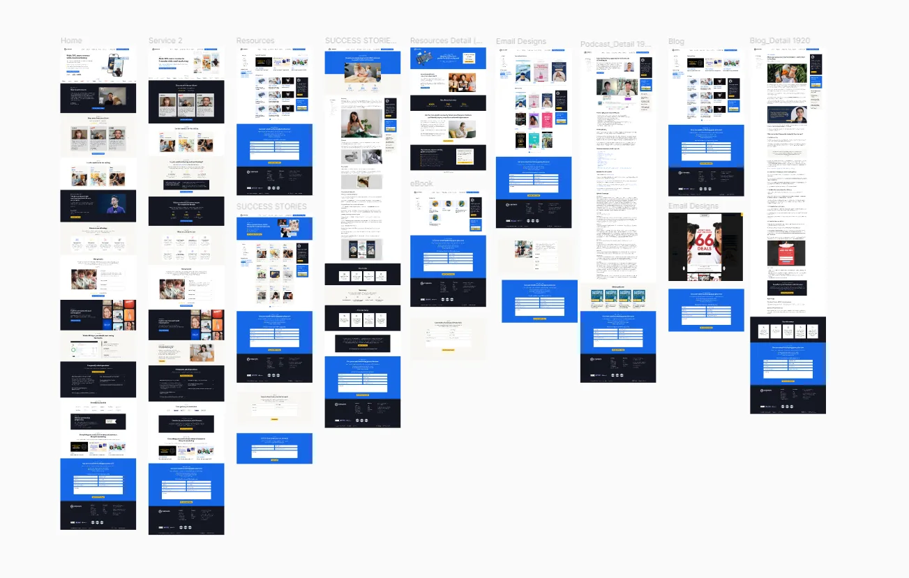
My guide to web design best practices covers the design standards I hold builds to, and my guide to mobile-first design covers designing for small screens first.
What to do next
- List the pages and components where exact fidelity matters most.
- Agree breakpoints and a review process before the build starts.
- Set up design tokens shared between Figma and code.
- Add visual regression tests for key templates.
- If you want a second opinion on your design-to-build process, book a free call with my team.
Frequently asked questions
What is a pixel perfect website?
A pixel perfect website is one built to match its approved design exactly, with no unintended differences in layout, spacing, size, colour or type. On modern responsive sites, this means a match within an agreed tolerance at agreed screen sizes and browsers, and faithful behaviour between them.
Why does my website look different from the design?
Common reasons include different fonts or font rendering, browser defaults, content that is longer or shorter than in the design, screen sizes between the designed breakpoints, and values rounded during the build. Compare at the same screen size, then check spacing and type values in the browser’s developer tools.
Is pixel perfect design bad for responsive websites?
Not if you treat it as fidelity rather than an identical image everywhere. Forcing a fixed layout onto every screen breaks responsiveness and accessibility. Agreeing designs at key breakpoints, with clear rules for in between, gives you a faithful build that still adapts.
How do you test if a website matches the design?
Overlay the design on the live page at the same width using a browser extension, inspect values in developer tools, and review each key template at each breakpoint. For ongoing protection, add visual regression tests that compare screenshots after each change.
Does pixel perfect design affect SEO?
Not directly. Search engines care about content, structure, speed and usability, not pixel-level matching. Chasing pixel perfection with heavy images or complex code can hurt speed and accessibility, which do matter. Prioritise structure and performance, then refine the visuals.