Have you ever been on a site where you feel reluctant to close the tab instantly? I bet you have at least once in your life.
So what is it about the website that urges you to click the cross mark? Is it the ambience or the feel that doesn’t connect with you?
When you talk about web design, it’s always about web standards. You will rarely find people talking about bad design. Because they want to replicate the best design standards, not the ones that suck.
Need WordPress Support?

A poor design comes with great experience and a lesson for the future. knowing the downside of design helps you in proper decision making.
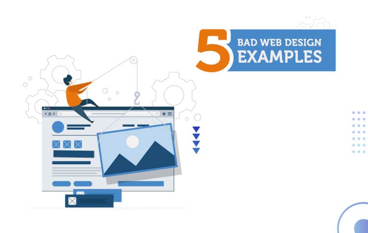
So, to speed up your decision-making process, we have collected 5 worst web design examples that will make you feel that your website is a gem.
However, before diving into it here is a quick summary of what makes a poor design.
- The design choice is incoherent. It looks like hundreds of people were involved in the design building with different opinions of their own.
- The key information isn’t transparent.
- The colour combination doesn’t match with the theme and niche.
- Typography and graphics are horrible.
- A website isn’t responsive in nature.
- No or poor use of call to action buttons.
- Takes ages to load.

Now coming straight to the topic, here are the 5 examples of bad web design that will make you feel that your website is a gem.
Arngren

Arngren is a classified site built on the Norwegian language. This site takes the worst design to an extreme level by defying every single principle of web design. It reminds me of the yellow pages of 90’s where advertisers used to fight to fit into a small box of the page. This is the website that replicates the same design.
Looking to increase your organic traffic? Contact our SEO agency in Melbourne.
We are in 2017. These days’ people try to follow the design from most successful sites like eBay and Amazon. But Arngren doesn’t care about the rules. It literally places the graphics, content, and links wherever it wants to make the site a comprehensible mess.
Reasons for the nomination on bad design category:
- Poor navigational structure.
- Typography is small and confusing for the readers
- Lacks a clear message of the business.
- Random use of colours.
Source: https://arngren.net/
Why do You need To Redesign Your Website?
Bavarian Brathouse

Have you ever looked at a drawing made by your son when he was in a kinder garden? If you want to see it live on the web, Bavarian Brathouse is the go to a website. It looks like the artist was on drugs when he made this website.
It feels like an 80’s street walls where pamphlets were attached for information. The website is just there for the sake of a name. A background image of a wall with no parallax effect and dull graphics makes it one of the worse websites.
Reasons for the nomination on bad design category:
- Lacks aesthetic design with no defined navigation.
- Overflush left body copy with no clear message.
- Poor use of graphic that doesn’t resonate with business value.
- It doesn’t have any call to actions.
Source: https://bavarianbrathaus.info/
Pacific Northwest X-Ray Inc.

Pacific Northwest X-Ray Inc or as the site says PNWX is a site that basically covers everything related with X-Ray. It’s amazing how such an important site is handled so poorly. Although, it’s able to portray its information straight away, the clear picture is far away from this website.
You can clearly see the conflicts among the text and colour where they don’t blend with the background. It definitely looks like a site made in the early 2000s where the design wasn’t considered the “big thing.” The footer section mentioned the website as a catalogue is a clear sign that this website isn’t maintained for commercial purposes.
Reasons for the nomination on bad design category:
- Bad typography with poor readability feature.
- Fonts and colour don’t connect with the website.
- Lacks proper call to action. There is only a phone number that too at the bottom.
- Flash is dead.
Source: https://www.pnwx.com/
Rudgwick Steam & County Show

I don’t know if I should say this website an ugly website or another example of a poorly crafted design. When I landed on this website, I didn’t know where I should start. I was literally confused with the lack of proper navigation and readability nature. The welcome message is below the fold and has no clear cut meaning on the expectations. It looks nothing more than a list post rather than a website.
Reasons for the nomination on bad design category:
- Links on navigation doesn’t work.
- Random use of colours that give negative vibes.
- Lacks a clear picture of the website.
- Large meaningless graphics
Source: https://www.rudgwicksteamshow.co.uk
What is a Mobile-First Design? Why It’s Important for Your Business?
Penny Juice Bad Website

This website basically targets kids under a certain age to drink penny juice. Although, it has a basic tagline that says “Who is Penny Juice”, it still lacks the major theme. The extreme use of colour makes the website look nothing more than a kid trying to learn his first paint.
A proper website should use white space properly. However, this site doesn’t have any white space. It just has every section divided into colours like a rainbow. And the text is just there without any substance. I would define this website like the one dedicated to kid designed by a kid.
Reasons for the nomination on the bad design category:
- Poor user experience.
- Random use of colour with text that’s hardly readable.
- No white space used. It’s clearly not pleasing to the eye.
- No navigation whatsoever. I have to reach to the bottom to find some information.
Source: https://pennyjuice.com/

Having Problems With Your Website?

Wrapping up
There aren’t many websites in the market that are perfect. Business owners who invest in cheap designers tend to have these kinds of issues. Nevertheless, you can improve your site’s presence by taking something out of these websites. Hopefully, you won’t make the same mistakes that these websites have done.